The Fintech Landscape
The financial technology industry is undergoing rapid changes.
As per the latest findings from Allied Market Research, the global fintech market is projected to expand sixfold over the coming decade, growing from $110.57 billion in 2020 to an estimated $698.48 billion by 2030. This equates to a compound annual growth rate (CAGR) of 20.3% during this period.
A majority of global banking leaders, over 66%, believe that fintech is set to revolutionize areas like digital wallets and mobile payments, thus broadening consumer access to financial services. Customers of these financial institutions are also increasingly valuing fintech innovations.
In the United States alone, more than 65% of the population uses financial software.
Fintech emerges from the interplay of demand and supply. Consequently, the market is flooded with numerous finance and banking apps. This, however, doesn’t mean there’s no room for your offering. Building a fintech application, nevertheless, is a considerable undertaking.
For those engaged in the fintech sector, where user experience (UX) is a crucial factor, the importance of Product Managers has escalated. Serving as the intermediary between technological advances and customer requirements, Product Managers are responsible for crafting digital solutions that not just satisfy but exceed user demands. A key element in this effort is the conceptualization and development of dashboards for banking and fintech apps.
This report provides an in-depth look into the complex world of dashboard design, offering a thorough examination from both theoretical and hands-on perspectives. By investigating the nexus between product management and fintech UX design, we aim to furnish a useful guide for both veteran and novice Product Managers who are in search of new ideas and innovative strategies for dashboard development.
Study Objective
The primary objective of this analysis is to offer a thorough exploration of the challenges involved in creating dashboards for fintech and banking applications.
It is designed to equip Product Managers with an in-depth understanding of the data visualization process, guiding them in the intricate task of transforming raw data into accessible, user-friendly interfaces.
Through meticulous scrutiny of findings, metrics, and real-world case studies, this document aims to unveil groundbreaking ideas and methodologies that may still be under the radar.
By harnessing insights from both product management and UX design, we seek to highlight unexplored avenues for enhancing the functionality and aesthetic quality of banking and fintech dashboards.
Target Audience
This report is tailored for two primary audiences: Product Managers in general and those specifically working in the fintech and banking sectors.
For seasoned professionals, it acts as a resource for keeping abreast of emerging trends, innovative concepts, and contemporary best practices. For those new to fintech and banking, it serves as a guiding compass, helping them navigate the complex world of dashboard design with assurance and skill.
By integrating insights from both product management and fintech UX design, the goal is to arm readers with the knowledge to transform their approach to dashboard creation.
The end objective is to pave the way for the development of more intuitive, engaging, and efficient applications in the banking and financial technology spaces.
Overview
In the fast-paced world of fintech, the importance of user experience cannot be overstated. One of the most critical elements that contribute to an optimal user experience is the design of effective and user-friendly dashboards.
This report offers a comprehensive guide to designing dashboards for fintech and banking applications, aimed at both seasoned and aspiring Product Managers and UX designers.
Key Features for A Fintech App Dashboard
This section delves into the essential features that any fintech app dashboard should include. From security elements to data presentation, we examine what makes a dashboard not just functional but exemplary.
Achieving Product Market Fit
Understanding and achieving product-market fit is essential for any fintech product’s success. This segment outlines strategies and metrics to ensure that your dashboard not only meets but exceeds market demands.
The Psychology Behind Building Dashboards
User behaviour and psychology play a pivotal role in how dashboards should be designed. This chapter explores the psychological principles that inform effective dashboard design, including aspects like cognitive load and user engagement.
User-centric Design and the Principles for Designing Dashboards
This section focuses on putting the user at the centre of your design strategy. We discuss key principles that can guide the design process to make your dashboards as intuitive and user-friendly as possible.
Best Practices When Designing a Dashboard
Best practices can serve as a strong foundation in the process of dashboard design. This part of the report highlights tried-and-true methods and industry standards for crafting efficient and effective dashboards.
From Data Visualization to Dashboards – Resources and Guidelines
Transitioning from raw data to a fully realized dashboard involves multiple steps and considerations. This chapter offers resources and guidelines to assist you in this journey, from data visualization tools to integration methods.
Plan and Build a Dashboard for Your Banking and Fintech Apps
Planning and building are the execution phases of dashboard design. This section provides a step-by-step guide on how to go from concept to completion, ensuring that your dashboard meets all technical and user experience requirements.
Elements and Features for Banking and Fintech Dashboards
Last but not least, we outline the specific elements and features that are particularly important in the context of banking and Fintech applications. This will cover everything from real-time data feeds to interactive elements that can make or break the user experience.


Through these key segments, this report aims to empower professionals with actionable insights and practical advice, blending product management and UX design expertise to navigate the complexities of dashboard design effectively.
Key Features for A Fintech App Dashboard
Vitaly Friedman, Founder/Editor-in-chief of SmashingMag said the following about UX design:
A dashboard’s main purpose is to convey insights, not just raw data. It suggests incorporating a section for key highlights based on user preferences and offering customization options to display more information in a compact space.
The ability to share the dashboard through a public URL is recommended. The quote also stresses the importance of robust filtering capabilities with preset filters and the option to manipulate column arrangement by hiding, pinning, or locking them.


Exporting and duplicating the dashboard are also highlighted as crucial.
Friedman reminds us that certain critical dashboard features are often neglected, and underscoring the significance of these features in the context of creating a budget-conscious fintech app is vital.
Adaptive UI
Potential fintech consumers are becoming more familiar with adaptive user interfaces, which are adaptable and simple to alter for specific customer demands. Make sure that your app’s user interface can transition between minimum and detailed views, permit the creation of shortcuts, enable dark mode, and more.
Advanced Security
This is required for apps that deal with finances because losing customer trust or leaking user data is unacceptable.
To ensure a high level of security in your FinTech solution, therefore, is crucial.
For this, take into account the procedures for onboarding and authentication, the transmission of encrypted data to other financial institutions, the storage of data, and more.
Reminders and Notifications
A great approach for an app to notify its users of impending events, such as scheduled payments, balance replenishment, tax days, and much more, is through notifications and reminders.
Online Chat
Setting up an online chat helps businesses in the finance industry de-stress their customer-support employees. Additionally, chatbots enabled by AI enable lots of people to resolve their problems around the clock, enhancing your customer service.
Simple Bank Connectivity
This is one of the main characteristics of most FinTech products. Customers prefer to do their tasks quickly and without having to wait in line at physical locations. Make sure your software interfaces with as many local banks as feasible for your users.
Payment Gateway
It permits making electronic payments and money transfers, which is essentially one of the key benefits that attract consumers to install FinTech software on their gadgets.
Learn how to select and include a dependable payment gateway into your digital solution.
Thought Leadership and Extra Resources
Achieving Product Market Fit with Paweł Huryn
According to Dan Olsen, product-market fit happens when:
“(…) you have built a product that creates significant customer value. This means that your product meets real customer needs and does so in a way that is better than the alternatives” – The Lean Product Playbook
Pawel’s Insights
There are two things people often struggle with:


Before Creating a Product


- Conduct market research, estimate market size (TAM, SAM, SOM), and divide clients into groups according to unmet needs. Porter’s Five Forces and PESTEL analysis are common methodologies.


Resources:
Part I: Market and Value Proposition
Part II: Product and Business Model
The Psychology Behind Building Dashboards
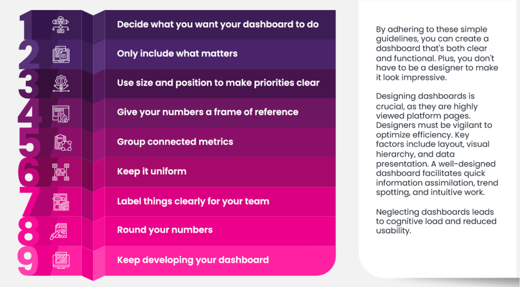
In the quest to build a superior dashboard, it’s crucial to focus on key principles that elevate its utility and impact.
One handy way to remember these cornerstones is the acronym ACES, which stands for Accurate, Clear, Empowering, and Succinct.


Each of these attributes plays a vital role in the effectiveness of a dashboard, making it a go-to resource for informed decision-making.
Resource: How To Design A Dashboard (free eBook), by Matt David
User-centric Design and the Principles for Designing Dashboards
What do the concepts of dashboard design look like in practice?
This resource by Geckoboard will lead you through eight golden rules with examples from actual dashboards. Here is a sneak peek:


User Area Design — Guidance for Dashboards offers valuable UI design tips for both novice and experienced designers to create effective dashboards.
Best Practices When Designing a Dashboard
Dashboard UI Design: 14 Best Practices for Stakeholders via Adam Fard
The significance of user experience is increasingly acknowledged, leading to a growth in dashboard UI tools variety. These tools play a vital role in effective customer experience strategies.
The challenge lies in creating a dashboard UI that offers users quick access to necessary website information. Dashboards hold the potential to influence user behaviour and retention rates.
Data-driven design can create actionable dashboards with relevant information. The success of these hinges on proper and modern UI design, ensuring easy information access and scannability.
UX designers play a key role in making informed choices among tools and features for optimal outcomes.
Thankfully, the top 14 methods that enable all of this are listed in this resource for anyone who has been asking how to create a Dashboard user interface.
From Data Visualization to Dashboards
Comprehending data visualization is crucial in UX design for several reasons:


- Effective Communication: Data visualizations are a means of conveying complex information in a visually engaging manner. A UX designer needs to ensure that users can quickly and accurately interpret these visualizations to understand the underlying data, trends, and insights.
- User Empowerment: Well-designed data visualizations empower users to make informed decisions. When users can easily comprehend and extract meaning from the data presented, they are better equipped to take appropriate actions based on that information.
- Engagement and Retention: Engaging and intuitive data visualizations keep users interested and encourage them to explore further. If users can’t understand the visualizations, they are likely to disengage, which can impact their overall experience and retention on the platform.
- User-Centered Design: Data visualizations should align with users’ mental models and cognitive processes. A UX designer needs to design visualizations that match how users naturally perceive and process information, ensuring a seamless and intuitive experience.
- Avoid Misinterpretation: Poorly designed data visualizations can lead to misinterpretation and incorrect conclusions. Users might draw inaccurate insights or make wrong decisions if the visualizations are unclear or misleading.
- Efficient Problem Solving: Data visualizations are often used to identify patterns, trends, and outliers. A UX designer’s role is to create visualizations that facilitate efficient problem-solving by making these patterns easily discernible.
- Consistency and Familiarity: Consistent and familiar data visualization styles help users recognize and understand visual elements across different parts of an interface. This enhances user confidence and comfort when interacting with data.
- Accessibility and Inclusivity: Ensuring that data visualizations are accessible to all users, including those with visual impairments, is a key consideration in UX design. Proper labelling, alternative text, and compatible colour choices are essential to make visualizations inclusive.
- Data-Driven Decision-Making: Many digital platforms rely on users making decisions based on data insights. A UX designer’s role is to present data in a way that supports users’ decision-making processes.
Resources and Guidelines
How do you pick the right data visualization?
Vitaly Friedman shares that Data Viz Project breaks down all types of data visualization by input type, function, and shape, and highlights some great examples of data visualization for each.
Resources:
A Guide To Getting Data Visualization Right, by Sara Dholakia
Data visualizations serve as a widespread method of communication, conveying complex information in a visually appealing manner. They’re used in various contexts, from news to product packaging. The diversity of visual styles in both digital and print media can be overwhelming.
This article aims to simplify the selection process by explaining common visualization types. The terms “graph” and “chart” are clarified here: graphs depict data on a Cartesian plane, while “chart” encompasses various data visualizations.
The resource discusses considerations for choosing the appropriate chart type based on specific needs.
Resources:
Plan and Build a Dashboard for Your Banking and Fintech Apps
How to Design a Mobile Banking Super App
The rise of cutting-edge technology has dramatically transformed the banking sector, enriching user interactions with increased ease, speed, and pleasure. While many traditional banks struggle to adapt to the digital age, neobanks have quickly come to the forefront, challenging long-standing practices.
One significant hurdle is creating a unified banking environment that offers a cohesive user experience across a variety of products.
This could eventually evolve into a full-fledged banking-as-a-platform model. The ideal banking super app’s UX/UI design exemplifies how financial organizations can improve their mobile banking platforms by incorporating current banking trends.
A smooth, user-centric fintech UX not only simplifies finance but also makes it an enjoyable activity. Elevating a user-friendly fintech UX to a delightful financial experience involves satisfying the demanding standards of today’s consumers.


Modern consumers, equipped with ample information and choices, have brands vying for their attention through customized services aimed at increasing customer happiness.
To differentiate themselves, companies must focus on consumer wants and go beyond what’s expected. By deeply understanding their customers and devising ways to surpass their expectations, fintech firms can capture and hold their interest, often offering solutions the customers didn’t even know they needed.
The secret to triumph lies in weaving user experience design into every aspect of decision-making, thereby reducing obstacles and laying the groundwork for enjoyable financial functionalities.
This strategy has allowed fintech companies to redefine excellence in the financial services landscape.
Resources:

